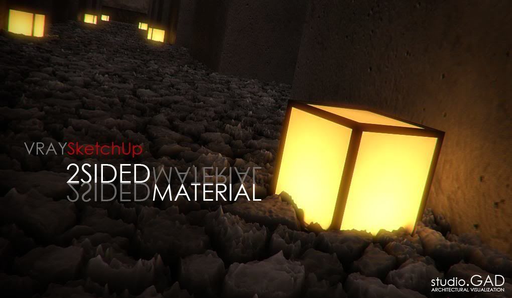
James Cutler written this tutorial for Mintviz

Diffuse
Diffuse
This is the actual colour of the surface, reflection and refraction colours can affect the visual appearance of this colour. It is important to understand that no material in the real world is pure white RGB (25,255,255) nor pure black RGB (0,0,0). When creating a white or black material, set the colour values to an off white RGB (245,245,245) / black RGB (2,2,2). If you render an object that is pure white or pure black you will notice that there is no contrast. The light rays are bouncing all over the place, and not being absorbed.
Roughness
Reflection
Reflect
Like diffuse it uses a colour value to determine the reflection strength. White RGB (255,255,255) is fully reflective and black RGB (0,0,0) is not reflective at all. By using colour instead of grey scale you will get coloured reflections. You would commonly use a grey scale value to determine the reflection strength and there is no right or wrong value so you will have to take your best judgement. However the following can be used as a guide.

By default the reflection colour acts as a filter for the diffuse colour and the stronger the reflection colour the dimmer the diffuse colour.
Metals
- Pure aluminium polished, 80 – 87 %
- Pure aluminium matte, 80 – 87 %
- Polished aluminium, 65 – 75 %
- Matte aluminium, 55 – 75 %
- Aluminium painting, 55 – 65 %
- Chrome polished, 60 – 70 %
- Steel, 25 – 30 %
- High polished copper, 60 – 70 %
- High polished brass, 70 – 75 %
Composites
- Light oak (Polished), 25 – 35 %
- Dark oak (Polished), 10 – 15 %
- Wood chipboard, 25 – 40 %
- White paper, 70 – 80 %
Ceramics
- Granite, 20 – 25 %
- Lime stone, 35 – 55 %
- Polished marble (Depending on colour), 30 – 70 %
- Light stucco, 40 – 45 %
- Dark stucco (Rough), 15 – 25 %
- Concrete (Rough), 20 – 30 %
- Bricks new, 10 – 15 %
- White tiles, 75 – 80 %
- Glass, 5 – 10 %
Finishes
- White enamel, 65 – 75 %
- White lacquer, 80 – 85 %
- Silver mirror, 80 – 88 %
- High polished mirror, 92 – 95 %
Diffuse colour also affects the reflection intensity. White reflects the entire visible colour spectrum whereas black absorbs all colour.
- White, 75 – 85 %
- Light grey, 40 – 60 %
- Middle grey, 25 – 35 %
- Dark grey, 10 – 15 %
- Light blue, 40 – 50 %
- Dark blue, 15 – 20 %
- Light green, 45 – 55 %
- Dark green, 15 – 20 %
- Light yellow, 60 – 70 %
- Brown, 20 – 30 %
- Light red, 45 – 55 %
- Dark red, 15 – 20 %
- Black, 2 – 5 %
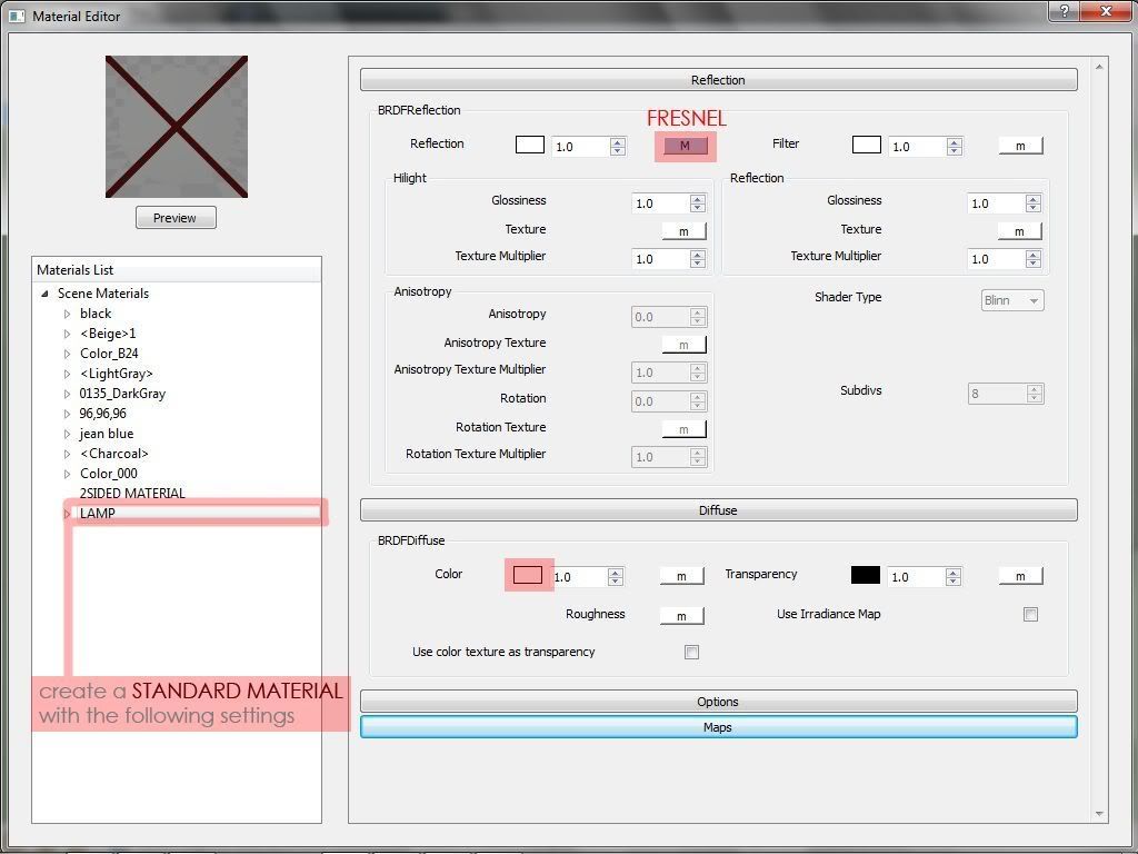
Fresnel reflections
Most materials except metals have a Fresnel reflection, making the reflection strong at glancing angles but weak at more front on angles. A good example of this would be to look at an old CRT monitor, where the viewing panel is glass. If you position yourself to the side of the monitor and look into the glass you will clearly see a reflection of the environment, but if you position yourself directly in front you will notice that the reflection is reduced. Fresnel is a good approximation and is as close to physically correct materials as you can get whilst keeping the rendering times low.
The Fresnel Effect was first documented by the French physicist Augustin-Jean Fresnel (1788-1827). Fresnel studied the behaviour of light and how it was transmitted and spread by different objects.

Fresnel IOR
IOR stands for index of refraction and is used to measure how light refracts through a surface relative to the viewing angle (Yourself), confusing at first but read on. Place a stick in a pool of water, notice how the stick bends below the water surface? As light passes through the water surface it changes speed and bends.
IOR can also be used to measure reflection and how light reflects off a surface relative to the viewing angle (Yourself) and although calculated in a slightly different way they are usually directly proportional. Therefore the same IOR value is a good approximation for both reflection and refraction. This is why by default it is locked to the refraction IOR. A formula known as Snell’s law is used to describe the relationship between the angles of incidence (Viewing angle) and refraction which gives you the IOR.

You can find many IOR tables on the internet and they all give different values for real world materials. The truth is there is no actual value, it depends purely on the material and its characteristics such as dirt, scratches rust and so on. But if you need a value then below is a good starting point for the most common materials.
- Water 1.333
- Glass 1.5 – 1.6
- Diamonds 2.13
- Compound materials such as wood, stone, concrete etc. 3 – 4
- Plastics 5 – 8
If an IOR of 1 is used, then light reflects/passes off/through the surface without changing direction, meaning it has the same density as air. Materials such as glass allow light to pass through, but also reflect. The ratio between reflection and refraction is dependent on the viewing angle. Geometry must have a thickness to refract properly. If you have window glass that has no thickness use an IOR of 1.0.
You can control the Fresnel reflection using a falloff map. However this method is known for rendering slower than the built in Fresnel control.

A falloff map will create a transition between the front and side colours (By default front is black, sides are white). It will use the falloff type to determine the type of reflection. With Fresnel selected, the black colour will be positioned front on angles and it will transition to white as it becomes more of a glancing angle. You can change that falloff by adjusting the IOR value, or by adjusting the output curve, or both.
Highlight glossiness

In the real world highlights are reflections of light sources and the surrounding objects. In computer graphics there are two different methods to calculate the same effect. The first is to make no distinction between lights and objects. The second is to treat lights separate from objects. One may be desired over the other for a particular scene.
By default highlight glossiness is locked to the reflective glossiness because in the real world they are the same thing. Highlight glossiness is better known as specular. It takes the reflection of a direct light and adds it to the surface of the material, since direct light is usually round the specular highlight is therefore round.
The 3ds Max Scanline renderer calculates reflection this way, and although unrealistic it is still favoured by some for artistic reasons. In reality reflections come from the area of the light source such as a bulb, therefore it would not be round and it would have certain characteristics. If the highlight glossiness is unlocked you can control its shape separate from the reflection glossiness. This has become part of the method for achieving car paint materials.
Reflection glossiness
A value of 1.0 means the reflection is mirror, lower values mean the reflection is more blurred. The more blurred the reflection the longer it takes to calculate.
Subdivs
This controls the quality of the reflection glossiness. The higher the reflective glossiness, the lower subdivisions you can have. If the subdivisions are too low the result will be very noisy.
Use interpolation
You can cache glossy reflections to speed up rendering. Since light cache for glossy rays has been introduced, this method is somewhat redundant as the results were never that good.
Dim distance
You can set the maximum distance a reflection ray will travel. As an example, if set to 100mm, anything outside the 100mm radius will not be reflected.
Dim fall off
A fall off radius for the dim distance.
Max depth
Controls the amount of times a light ray can reflect. A max depth of 1 means only 1 reflection on the surface and a max depth of 2 means that a reflection of a reflection can occur on the surface. Higher values increase render times.
Exit colour
When the max depth has been reached it will use the exit colour. You may reduce the max depth to keep render times low and instead rely on the exit colour. In most cases you would set the exit colour the same as the diffuse colour such as for a green glass bottle.
Refraction
Refract
A colour value is used to determine the refraction strength. White RGB (255,255,255) is fully refractive and black RGB (0,0,0) is not refractive at all. By using colour instead of grey scale you will get coloured refractions. You would commonly use a grey scale value to determine the refraction strength and there is no right or wrong value so you will have to take your best judgement. However the following can be used as a guide.
By default the reflection colour acts as a filter for the diffuse colour and the stronger the reflection colour the dimmer the diffuse colour. For tinted glass it is best to control the tint colour via the refraction colour. By setting the diffuse colour to black (0,0,0), it has no effect on refraction colour. You are effectively turning the diffuse colour off.
IOR
An Index of refraction (IOR) value describes the way light bends as it travels through a surface. A value of 1.0 means the light will not change direction.
Glossiness
A value of 1.0 means sharp, clear refraction, lower values mean the refraction is more blurred and frosted. The more blurred the reflection the longer it takes to calculate.
Subdivs
This controls the quality of the refraction glossiness. The higher the refractive glossiness, the lower subdivisions you can have. If the subdivisions are too low the result will be very noisy.
Use interpolation
You can cache glossy refractions to speed up rendering. Since light cache for glossy rays has been introduced, this method is somewhat redundant as the results were never that good.
Max depth
Controls the amount of times a light ray can pass through a surface before it stops. A max depth of 1 means that only 1 refraction through a surface and a max depth of 2 means that a refraction of a reflection can occur on the surface. Higher values increase render times. As an example if you were to look through a drinking glass it would have 4 surfaces. A max depth of 4 would be correct. However you may need to take into account loss of light energy therefore higher values are needed.

Exit colour
When the max depth has been reached it will use the exit colour. You may reduce the max depth to keep render times low and instead rely on the exit colour. In most cases you would set the exit colour the same as the diffuse colour such as for a green glass bottle.
Fog colour
Controls the attenuation of light as it passes through the surface, darker colours absorb more light whereas lighter colours don’t absorb the light as much. Naturally thicker objects will become less transparent than thinner objects. By setting the fog colour to green it can be used to simulate coloured glass.
Fog multiplier
The strength of the fog colour is controlled by the multiplier. Higher values will make the object less transparent and lower values will make the object more transparent.
Fog bias
If used it will control the way in which the fog colour is applied. You can make thinner parts of the object more or less transparent than the default.
Affect shadows
If ticked, the object will cast transparent shadows, depending on the refraction and the fog colour.
Affect Channels
Here you can specify which channel is affected by the transparency of the material. For glass you would need to choose all channels so that both reflection and refraction are effected.
Dispersion
In the real world as a ray of light travels through a refractive object it produces a caustic effect which consists of a ray of colours. This is now an option in Vray 2.0, previous versions of Vray only allowed you to render white.

Abbe
At the default value the amount of dispersion is physically accurate in accordance with the IOR. You can increase or decrease for artists reasons. Increasing the value means the dispersion will be less visible and narrower whereas decreasing the value will spread out the dispersion and make it more intense.
Translucency
Type
You cannot see through a translucent material, but light can partially travel through and be scattered around. Materials such as human skin and wax are some of the most common.
Back-side colour
By default the colour of the translucency effect is dependent on the Fog colour. However you can additionally tint the effect using this parameter.
Thickness
You can limit the number of rays that are to be traced below the surface of the material by adjusting the thickness. This would therefore limit the amount of visible light.
Light multiplier
Control the intensity of the visible light.
Scatter coefficient
The amount of scattering that will occur inside the object. 0.0 means rays will be scattered in all directions where as a value of 1.0 means a ray will not change its direction.
Forward/backward coefficient
Controls the scatter direction of a ray, 0.0 means a ray moves away from the surface. 0.5 means that a ray has an equal chance of moving forward or backwards. 1.0 means a ray will move towards the surface.
BRDF
The BRDF types determine the type of the highlights and glossy reflections for a material. You would use Ward for metals such as stainless steel. Blinn and Phong for plastics and none metals and Blinn for chrome materials. Calculation speeds do vary for each type. Phong is fastest, followed by Blinn, and then Ward.

Soften
You can control the blending between the light and dark areas within the specular reflection.
Fix dark glossy edges
Unwanted dark edges may appear, use this to eliminate them.
Anisotropy
Changing this value makes the reflection directionally dependent for materials that have a fine grain such as brushed metals and woods. Reflections would appear more blurred if you were looking against the grain. Reflections appear less blurred if you were looking with the grain. A value of 0.0 means the reflection is isotropic, meaning the reflection is the same in all directions.
Rotation
Control the orientation of the anisotropic effect in degrees. You can also use a texture map to control the direction.
UV vectors derivation
Options
Trace reflections
Turning this off means that reflections will not be traced, but highlights will still be shown.
Trace refractions
Turning this off means that refractions will not be traced.
Cutoff
Control the threshold for which reflections/refractions will not be traced. Reflections that hardly contribute to the final image sample will not be traced. Using a higher cut-off means faster render times. If set to 0 the render times will be very slow, there needs to be a threshold in order for Vray to know when to stop calculating.
Environment priority
Determines what environment map will be used when you override the environment of various materials and they reflect/refract each other.
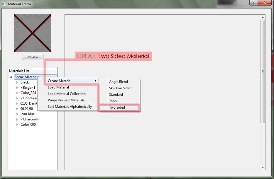
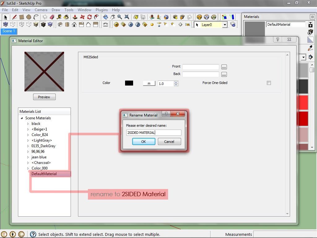
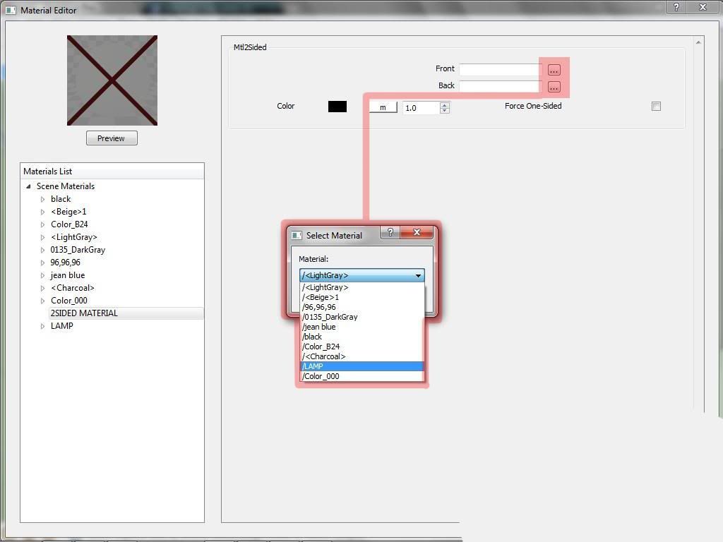
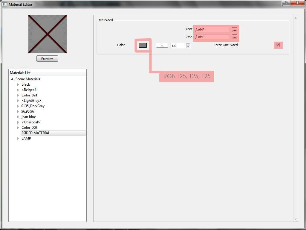
Double-sided
When ticked the back facing surface will be flipped. The Scanline renderer ignores back facing surfaces to speed up the rendering process. By default Vray will not ignore polygons, one of the reasons is because a back facing surface may still be visible within a reflection/refraction.
Reflect on back side
For materials such as glass you would need to turn this on to get a realistic result so that reflections are calculated on all surfaces. This will however increase render times.
Use irradiance map
By default the irradiance map is used to calculate diffuse indirect illumination of the material. Objects with fine details may render with artefacts, but you can render these objects better by turning off use irradiance map in the material. Then Brute forced will be used for that material only.
Fog system units scaling
Enabled by default, the fog colour attenuation becomes dependent on the system units. If your scene has not been modelled to real world scale you may get unwanted results with this on.
Treat glossy rays as GI rays
If set to always you are telling the material to always use the secondary GI engine to calculate the glossy rays, which in this case is the light cache. It basically does the same job as use light cache for glossy rays but you can specify individually which materials within the scene use this option.
Energy preservation mode
You can choose a different way of distributing light between the reflection and the diffuse layer. As in the real world the reflection level dims the diffuse and refraction levels causing the visible reflection to not be 100% of the reflection RGB value. To make the reflection 100% of the reflection RGB value, set it to monochrome, that way the diffuse colour has no effect on the resulting reflection colour.
Maps
Reflect/Refract interpolation
Here you control interpolation of glossy reflections. The options are somewhat similar to the options for the irradiance map in the render setup.